
Last updated: 2026-08-01
When you build a form in a chat, the very next thing you want is to see how it looks.
Until now that meant taking a preview URL and opening it in another browser tab. The place where you built the form and the place where you checked it were two different places.
With this update, that check happens inside the chat. Ask to see a preview, and a preview card for your form renders directly in the conversation.
This article covers what appears, how to ask for it, and what the card cannot do.
If you want the wider picture of using FORMLOVA from an AI client, I keep that in The FORMLOVA MCP Form Service Guide. This article covers only the reviewing part of it.
What appears in the chat
What you get is a card that reproduces the form itself, not a bulleted summary of it.
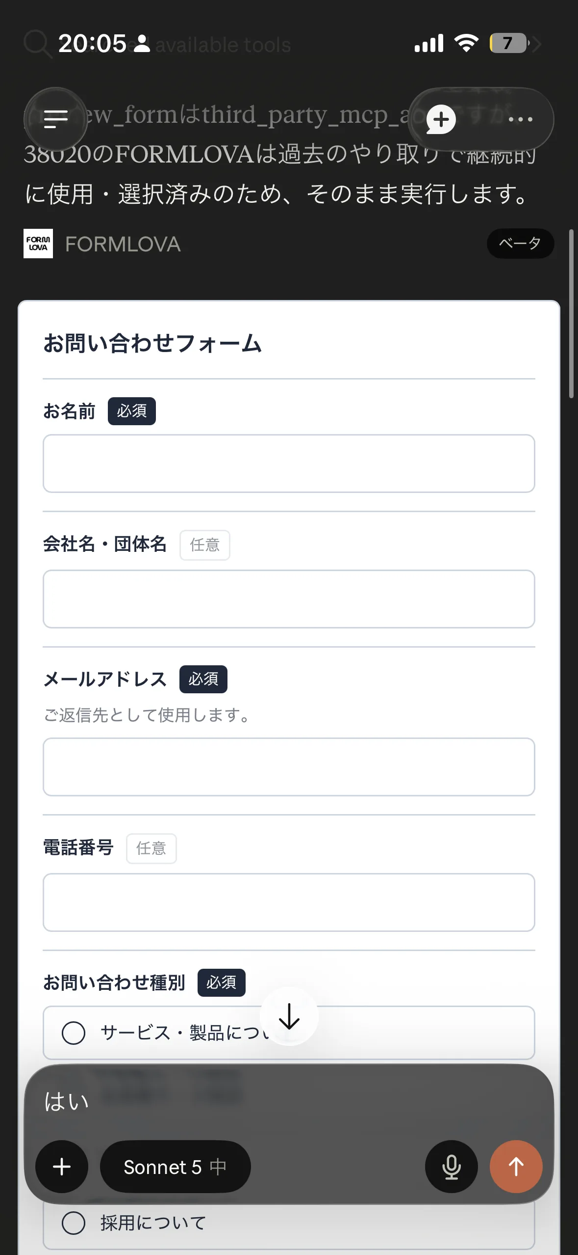
The card shows the following.
| Element | How it appears on the card |
|---|---|
| Question text | In the same order as the form |
| Required and optional | A badge on each question |
| Descriptions | Below the question, as supporting text |
| Short and long text answers | Drawn as bordered input areas |
| Choices | Laid out as radio buttons or checkboxes |
| Submit button | In the same position as the form |
Of the design settings you applied to the form, the colors and corner radius carry over to the card. Instead of looking at a default layout, you see how your own palette reads.
There is a reason this is a card rather than a text summary. "Your form has seven questions" tells you nothing about how it feels to answer. Is it too long? Are too many questions required? Do the choices run on? Those judgments need the questions laid out, not counted.
The wording on the card follows the language setting on your FORMLOVA account. If you work in English you see "Required" and "Submit"; if you work in Japanese you see the Japanese labels.
One thing to say up front: this is not the live form itself. It is a card shaped to resemble it. Fonts and logo images are not included, and a few question types, such as scale ratings, matrices, file uploads, signatures, and consent checkboxes, appear as the name of the type only.
The card is there so you can check, inside the conversation, what order the questions land in, what colors they carry, and how coarse or fine each question is. For a final detailed check, open the real form as before.
How to use it
There is nothing to configure. In Claude (web, desktop app, or iOS app) with the FORMLOVA connector already connected, say this about a draft form.
Show me a preview
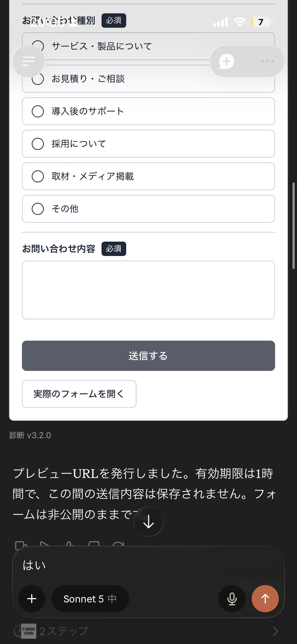
If you are working with several forms, name the one you mean.
Show me a preview of the seminar signup form
The first time, your AI chat may ask permission to display the app. That prompt comes from the chat client; allowing it lets the card render.
After you adjust the design, ask the same way again and the card comes back with the updated look. "Make the colors calmer," "round the corners" — you can ask for the change and see the result without leaving the conversation.
Below the card there is also a button to open the real form, for when you do want to look at the live version. That preview link expires after one hour, so that a draft does not stay reachable indefinitely. If time has passed, ask for the preview again and a card with a fresh link comes back.
When it earns its keep
You do not need to look at a preview every time. It earns its keep when a change shows up visually.
After you reorder questions, you can check whether the sequence reads better. Whether a confusing question landed first is easier to judge from the actual order than from a list.
The same goes for adding or removing choices. "I added three options" tells you less than seeing the three of them stacked up and deciding whether that is too many.
Color changes are where the difference is largest. Color names and hex codes do not convey an impression. With the real palette on the card, you notice that it reads darker than you expected, or that the button does not stand out. Say "make it a little lighter" and another card comes back.
Conversely, when you only reworded a question, or changed notification and email settings, there is little point in rendering a card. Nothing about the appearance moved.
You cannot answer inside the card
This is the constraint worth holding onto.
The input areas and the submit button on the card are appearance only. You cannot type into them, and you cannot press them.
Real responses go to the actual form behind the link, not to the card. Collecting answers still happens through the published form URL, exactly as before.
What this update changed is the effort of checking, not the way responses are collected.
When the card does not appear
If your AI chat does not support this kind of rendering, no card appears.
That is not an error. You get the same text reply with a preview URL that you have always received. Supported clients render the card; other clients fall back to the previous response.
So nothing about the existing flow breaks because of this update. Where it can render, it renders. Where it cannot, everything works the way it did.
Why a rendering surface inside the conversation matters
A little of the background, for context.
Rendering UI inside a chat is now an official MCP extension, MCP Apps (io.modelcontextprotocol/ui). The specification reached Stable on 2026-01-26, and FORMLOVA supports it properly. This is not a display trick I invented; it follows the standard.
FORMLOVA recently finished supporting the 2026-07-28 revision of MCP. I wrote about specification tracking and how tool definitions are handled in More Connections Do Not Always Make AI Smarter. This preview surface sits on the same line of work.
Once you decide the chat is the main surface, sending people to another tab for every check is half a decision. Build in the conversation, look in the conversation, fix in the conversation. Only then is it really finished in the chat.
The idea that a form is not done when it is built runs through Most Form Tools Stop at Creation as well. This update brings the step just before that — the pre-publish check — into the conversation.
Past updates are listed in the changelog.
Try it once
Take one draft form and walk through this.
1. Build a form in your AI chat
2. Ask to see a preview
3. Check the question order and the colors on the card
4. Ask for the changes you want, in the same chat
5. Ask for the preview again and look at the result
One pass through that loop shows you how many trips to the browser it removes.
The steps for connecting FORMLOVA to an AI chat are in the Setup guide. If you have not connected yet, that is the place to start.
Disclosure and Verification
This article reflects the FORMLOVA implementation as of 2026-08-01, verified against the MCP Apps section of docs/SPEC.md and docs/plans/2026-08-01-mcp-apps-form-preview-poc-design.md.
Primary sources consulted: