
Last updated: August 29, 2026
You can make Google Forms look more polished with its native theme controls. Start with the theme color and background color, then add a header image and choose text styles for the heading, questions, and body copy. Those changes are enough for a clean internal survey, a simple registration form, or a lightweight request flow.
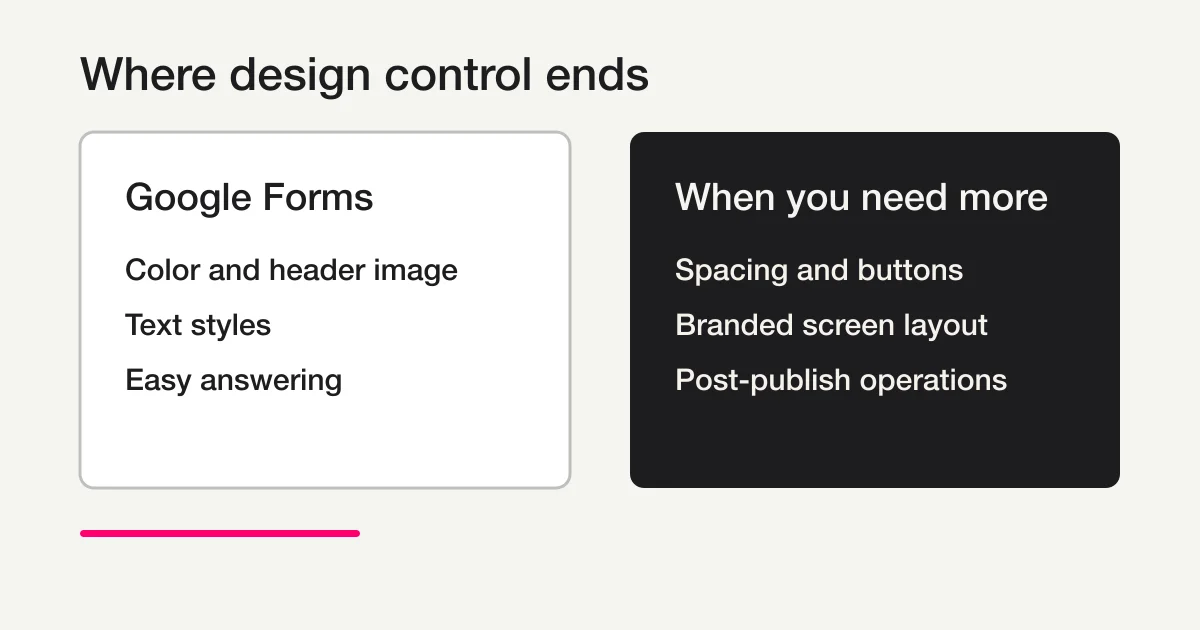
The boundary matters, though. Native Google Forms does not give you the same control as a branded page builder. Spacing, form width, button shape, question-card layout, and the details inside an embedded form remain largely part of the Google Forms interface. A good-looking form is therefore not about adding decoration until it feels special. It is about deciding which parts need to match your brand and which parts should remain simple for the respondent.
This guide walks through the visual settings, a practical review process, embed caveats, and the point at which a more flexible form experience is worth considering.
Quick answer: what Google Forms can and cannot style
| Design goal | Native Google Forms support | Practical reading |
|---|---|---|
| Theme color | Yes | Bring the main accent closer to your brand, but do not expect a separate value for every element. |
| Background color | Yes | Keep the question area and input controls easy to distinguish. |
| Header image | Yes | Design for the crop and check the result on a phone. |
| Heading, question, and body text styles | Yes | Create a clearer hierarchy, but do not assume your site font can be loaded directly. |
| Page width, spacing, and card placement | Limited | The page follows the Google Forms layout rather than your site grid. |
| Button shape and detailed controls | Not freely | Native styling is not a custom CSS surface. |
| Per-question visual treatment | Limited | Use wording, descriptions, images, and sections to create hierarchy. |
| Branded completion screen and next steps | Often limited | Consider the whole response experience, not only the first screen. |
If the form only needs a calm, readable appearance, these native controls may be enough. If an ad landing page, an application flow, or a customer-facing request must feel like part of your site, the fixed layout may become the real issue. Start with the form creation and use-case template guide for the wider map, then use the Google Forms, Sheets, and Apps Script operations guide for responsibility boundaries. The Google Forms how-to guide is also useful for the general workflow. This article focuses on appearance and its limits.
Step 1: decide what “better-looking” needs to achieve
Before opening the theme panel, decide what the form is supposed to communicate. Polished design is not the same as adding more visual elements. The right appearance depends on the context and on the moment when the respondent needs confidence.
For an internal survey, a quiet color scheme and obvious question hierarchy are usually more valuable than a highly branded header. For a job application, a restrained logo treatment and clear instructions can help the applicant feel that they are in the right place. For an event registration form, a header image can establish the atmosphere, while the date, audience, and required fields still need to be immediately readable.
Write down a few design decisions before you change any setting:
- What is the main color or visual reference?
- Should the background be close to white or carry a light tint?
- Is the header image meant to explain the event or simply set the mood?
- What should the respondent understand from the title and description?
- Which part might become difficult to read on a phone?
Keep the palette small. A muted text color on a pale background, an input area that blends into the page, or a header image with text that disappears after cropping will make the form feel less considered. Brand colors should be adapted for contrast instead of copied without checking readability.
Step 2: set the theme color, background, and header image
Open the form editor and open the panel for customizing the theme. Google's official help describes controls for a theme color and a background color, with an option to add a custom color when available. Under the header controls, you can select a built-in image or use your own image.
Match the theme color to the purpose
Choose a theme color that supports the form's purpose. A strong accent can work for a short event registration form, while a softer treatment may be easier to scan for a long survey. After changing the theme color, add several real questions and view the preview. A color swatch is not enough evidence that the form is readable.
The first check is hierarchy: can someone tell where the title ends, where a question begins, and where an answer is expected? If the visual order is clear, you do not need a larger palette. Use color as a guide, not as a substitute for structure.
Choose the background with the input area in mind
A tinted background can make a form feel less generic, but too much contrast can make the page look heavy. A very light background can also reduce the boundary between the question card and the answer control. Check the title, question text, option labels, required markers, and error messages together.
When a form feels crowded, first shorten the copy and move long explanations into question descriptions. Enlarging the visual treatment alone often pushes the actual answer controls farther down the page.
Prepare the header image for a crop
The header image appears at the top of the form and may be repositioned after selection. Design with that crop in mind. Keep important lettering and logos away from the edges, and do not place a long explanation inside the image when the same information can be written as selectable text.
A useful header image gives the respondent context: what the registration is for, what kind of event they are joining, or what kind of request they are about to submit. A logo-only header may look branded, but it does not always reduce uncertainty. Review the image at the size a phone displays it, not only as an original file.
Also check usage rights and publication scope before uploading a team photo, customer image, or internal document. A polished header is not worth creating an avoidable privacy problem.
Step 3: create hierarchy with heading, question, and body text
The theme panel lets you choose text styles for the heading, questions, and body text. The goal is not to find the most distinctive font. The goal is to help a respondent understand the reading order without effort.
Use a heading style that gives the form a clear purpose. Keep question wording short. Put a longer explanation in the description below the question rather than turning the question itself into a paragraph. A consistent distinction between title, question, and supporting copy will usually improve the experience more than a dramatic font choice.
After choosing the text styles, check the following in the preview:
- Does the purpose appear before the first question?
- Can a respondent distinguish question text from answer choices?
- Are required markers, validation messages, and helper copy readable?
- Do long lines wrap naturally on a small screen?
- Does the form still feel calm when several questions appear together?
If a Japanese or English label wraps awkwardly, reduce the sentence before trying to make the type larger. A form is an answering interface, not a brochure. Shorter copy is part of the design.
Step 4: review the live answering experience
Do not publish based only on the editor view. Open Preview and complete the flow from the first question to submission. The design succeeds only when the respondent can understand the purpose, enter the answer, recover from an error, and know what happens after submission.
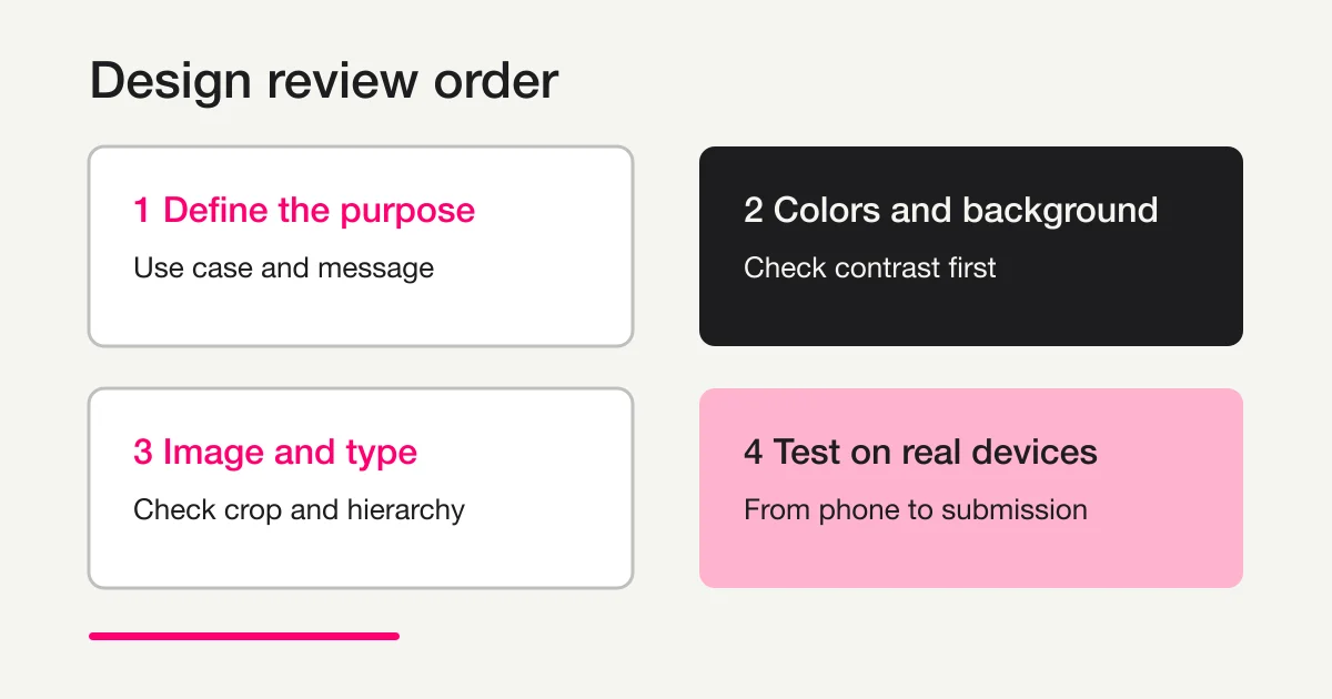
Use this review order:
- Check that the header image and the title communicate one clear purpose.
- Scroll to the first question and confirm that the next action is obvious.
- Check required fields, options, text inputs, and their boundaries.
- Trigger a validation error and read the message where it appears.
- Check a narrow phone viewport for image cropping, wrapping, and button visibility.
- Send a test response and confirm that the completion message gives the right next step.
Use dummy values for the test. The header can be perfect while a long label, a missing instruction, or a confusing completion message undermines the experience. Visual review and input review belong in the same pass.
Where native Google Forms design control ends
The page width and spacing follow the Google Forms frame
Changing the theme does not turn Google Forms into a page whose spacing and card width can be designed to match your website grid. The form can look narrower or more centered than the surrounding page. That is normal for a native form surface.
If the difference is harmless, a direct respondent link may be safer than trying to force an embedded form into a shape it was not designed to occupy. The title, header, color, and concise description can still create a coherent entry point.
Buttons, inputs, and question cards are not a custom CSS surface
Native controls do not provide a dependable way to redesign every button corner, shadow, border, input position, or question card. A script or CSS trick that rewrites the rendered page can break after an interface update and can make the form harder to maintain.
When a question needs emphasis, use order, wording, descriptions, images, and sections. If the next section should change according to a respondent's answer, see the Google Forms conditional logic guide for the supported native boundary instead of treating visual styling as a substitute for flow design.
The completion experience needs its own decision
The first screen is only part of the form journey. Decide what respondents need after they click Submit: a receipt, a contact route, a next event instruction, or a promise about when someone will respond. If the completion experience must be richly branded or behaviorally different for each response, include that requirement in the service decision.
For a broader feature-by-feature view of Google Forms limits and alternatives, read how to choose an alternative to Google Forms. It helps separate a visual limitation from an operations limitation.
What changes when you embed Google Forms
Embedding places the form inside your site while leaving the form itself as a separate display surface. You can style the surrounding page, including its heading, background, explanation, breadcrumbs, and contact details. That does not mean the parent page can freely change every color, margin, button, or input inside the embedded form.
Before choosing an embed, check these points on the actual page:
- Does the form fit the available width on desktop and mobile?
- Do the title and header image look duplicated with the surrounding page?
- Does the form height create a large empty area?
- Are validation errors and confirmation text readable inside the embed?
- Can you still measure the next step and respond to the submission appropriately?
If a direct link is acceptable, it may remove some layout friction. If the form must feel fully native to the surrounding brand page, do not assume that an embed alone solves the design problem. Compare a form experience with direct control over the public layout.
Google Forms or FORMLOVA?
Google Forms is a sensible choice when you need to collect answers quickly, want a familiar response workflow, and only need a controlled visual refresh. Keep the theme simple, test the answer path, and avoid maintenance-heavy attempts to rewrite the native interface.
Consider a different form experience when several of these statements are true:
- The form must share the same spacing, buttons, and input treatment as the brand site.
- Labels and page sections need tighter control than the native theme provides.
- The completion screen must connect naturally to the next action.
- You want to change the form and its follow-up operations from a chat conversation.
- Design, question logic, notifications, and response analysis need to be planned together.
FORMLOVA lets you describe the form's purpose and visual direction in chat, then review the result in Preview while you refine it. That is useful when the real requirement is not simply “make the colors nicer,” but “make this form feel like the right entry point and keep its operation understandable after publication.” The right choice depends on the amount of control you actually need, not on a promise that every form should be heavily designed.
Publication checklist
[ ] The use case and the visual impression are clear
[ ] Theme and background colors preserve readable contrast
[ ] Important header content remains visible on a phone
[ ] Heading, question, and supporting text have a clear hierarchy
[ ] Question wording is short enough to scan
[ ] Required fields and validation messages were checked in Preview
[ ] The embed was checked at desktop and mobile widths
[ ] The completion message and next contact route are decided
[ ] No fragile CSS or script hack is required to keep the form usable
Frequently asked questions
Can I change the colors in Google Forms?
Yes. Open the theme customization panel and choose a theme color and a background color. A custom color may be available as well. The controls do not mean that every individual element receives its own color value, so review the complete question and answer area for contrast.
Can I add my own image to a Google Form?
Yes. Use the header image control and prepare the artwork for the crop. Keep important logos and words away from the edges, then check the result on a phone. Use only images you are allowed to publish.
Can I change the font in Google Forms?
You can choose text styles for the heading, questions, and body copy from the theme panel. This is not the same as loading your website's font into every part of the form. Check long labels, line wrapping, and readability in the responder view.
Can I redesign the button, spacing, or form width?
Not freely with the native settings. Theme controls improve color, imagery, and text hierarchy, while the core layout and controls continue to follow Google Forms. If those details are part of the brand requirement, compare a form experience with deeper public-layout control.
Can my website CSS style an embedded Google Form?
You can style the page around the embed, but you should not assume that the parent page can freely style every element inside the form. Test width, height, errors, mobile wrapping, and the completion path on the actual page.
What should I change first to make a Google Form look better?
Start with the purpose and a small color palette. Then set the theme color, background, header image, and text styles. Finish with a full Preview test on a phone. If the native boundary still leaves several important requirements unmet, compare another form experience early instead of piling on fragile workarounds.
Disclosure and Verification
I work on FORMLOVA. On August 29, 2026, I checked the descriptions of Google Forms theme colors, background colors, header images, and text styles against Google's official Change the theme or font of your form help page. Google Forms labels and available controls can change with account type and product updates, so check the final responder view before publication. This article uses a flat comparison diagram instead of a fictional authenticated Google Forms screenshot.
If native styling does not cover your brand and workflow requirements, try FORMLOVA for free and describe the form's purpose and visual direction before reviewing the preview.
Image generation prompts
Hero image
Guide cover generated from the standard SVG template. All in-image text MUST be written in English: “Make Google Forms”, “Look Better”, and “Design Limits”. Use a flat light beige background, a salmon pink vertical line, charcoal text, and one pink underline. No gradient, illustration, icon, photo, logo, internal number, or website URL. Output the source SVG at 1200x630 and convert it to WebP for delivery.
Inline image 1
Flat editorial comparison diagram for an English article about Google Forms design limits. All in-image text MUST be written in English. Compare “Google Forms” with “When you need more” using charcoal, white, light beige, muted gray, and salmon pink. Show color, header image, and text styles on one side; spacing, buttons, branded layout, and post-publish operations on the other. No Google logo, no fictional Google Forms screenshot, no gradient, and no internal article number. Output at 1200x630 and convert to WebP.