
Last updated: May 1, 2026
Form conversion optimization is not making a form look cleaner. It helps visitors submit, recover from errors, and understand what happens after submission.
When a form performs poorly, teams look at field count first.
That is reasonable. Long forms create friction. Required phone numbers, premature address fields, and long text boxes can stop people before submission.
But optimization is not just "remove fields."
The real question: does the form match intent, explain fields, recover from errors, work on mobile, confirm the next step, and report valid submissions?
This guide treats optimization as a post-launch operating cycle. If you are still deciding what to build, start with the FORMLOVA Form Creation Guide. For field decisions, read the Form Field Examples Guide.
Quick Answer: Optimize the Whole Path, Not Only the Form Screen
A submission is not created by the form alone.
It comes from a path:
| Step | What to check | Common problem |
|---|---|---|
| Traffic intent | Does the visitor expect this form? | The ad, article, or page promises something lighter than the form asks for |
| Field count | Does the first form ask too much? | The team collects information that could be asked later |
| Required fields | Are required fields truly required? | Useful-but-not-essential fields block submission |
| Labels | Can people understand each field without guessing? | Vague labels such as "details" or "contact" |
| Help text | Does the form explain what matters? | People do not know why a field is needed |
| Error messages | Can people recover quickly? | The form says "invalid input" without a fix |
| Thank-you page | Does the visitor know what happens next? | Submission succeeds, but the user is unsure about timing |
| Analytics | Are the numbers clean? | Sales pitches, spam, duplicates, and tests inflate conversion rate |
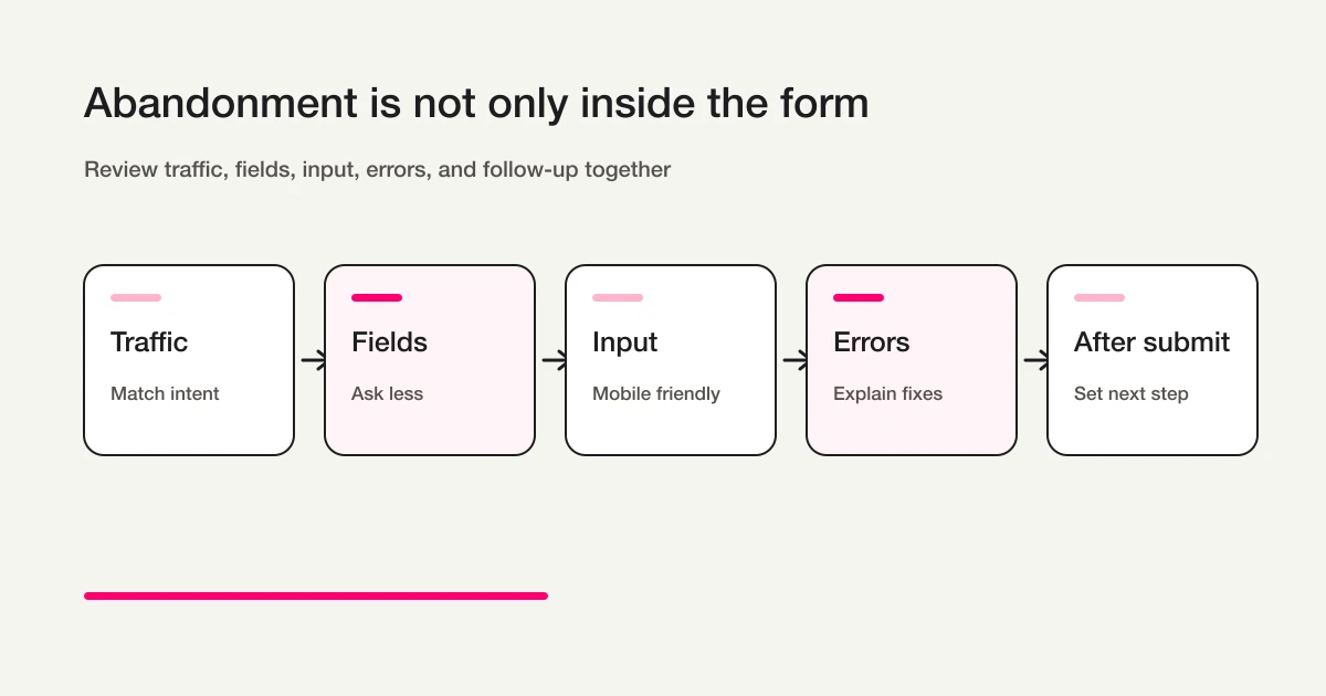
This is why form optimization cannot be reduced to one trick. A light-looking form can still fail if the promise, fields, errors, and follow-up do not match the visitor's intent.
Metrics to Track Before Changing the Form
Before changing labels or removing fields, separate the possible causes.
Track these metrics:
| Metric | What it tells you | Watch out for |
|---|---|---|
| Form views | How many people reached the form | Low views may mean the page or CTA is weak |
| Form starts | Whether visitors begin entering data | Low starts often mean the form looks too heavy |
| Completed submissions | How many people submitted | Include only real completions, not tests |
| Completion rate | The ratio from view or start to submission | Keep the denominator consistent |
| Error rate | How often people hit validation problems | High error rate points to format, required fields, or unclear messages |
| Field-level drop-off | Where people stop | Useful for spotting heavy fields |
| Valid submissions | How many submissions are worth action | Exclude spam, sales pitches, duplicates, and tests |
Conversion rate alone is too blunt. Low views point to the page or CTA. Low starts point to perceived effort. Low completions point to required fields, input formats, mobile usability, or errors. High completions with poor follow-up point to quality and classification, which connects to the Contact Form Operations Guide and Contact Form Spam Guide.
Fewer Fields Are Not Always Better
Field reduction is important, but it can become simplistic.
The goal is not to make every form as short as possible. The goal is to collect enough information to act while removing anything that creates unnecessary hesitation.
Use this rule:
| Field group | Keep it when | Move it later when |
|---|---|---|
| Name | The team needs a person or organization to reply to | Anonymous survey or low-friction content access |
| Reply, delivery, login, confirmation, or receipt is needed | Anonymous survey or on-page download | |
| Phone | Same-day contact, urgent scheduling, or offline coordination matters | The team mainly replies by email |
| Company | B2B context changes the response | Consumer or anonymous workflows |
| Address | Delivery, location, service area, or visit planning matters | Early inquiry or digital resource request |
| Long text | The team needs context to act | The user is registering, booking, or downloading something simple |
| Attachment | A file is essential to evaluate the request | Files can be collected after first contact |
The better framework is not "short or long." It is "required, optional, or ask later." The Form Field Examples Guide covers that decision in more detail.
Required Fields Should Be Operationally Necessary
A required field blocks submission.
That means it should be reserved for data the workflow cannot run without.
MDN's client-side form validation guide explains built-in validation attributes such as required, minlength, maxlength, type, and pattern. Those features are useful, but the product decision comes first: should this field be mandatory at all?
Better required-field decisions:
| Form | Usually required |
|---|---|
| Contact form | Email, category, message, consent if needed |
| Booking form | Service, first preferred time, second preferred time, contact method |
| Resource request | Name, email, requested resource, consent |
| Job application | Name, email, role, experience summary |
| Event registration | Name, email, attendee count, attendance format |
Before making a field required, ask whether the team can receive, reply, route, confirm, or act without it. If the answer is yes, the field may belong in optional or follow-up.
Labels, Help Text, and Placeholders Do Different Jobs
Small wording choices create real friction.
A label identifies the field. Help text explains how to answer or why the field exists. A placeholder gives an example inside the input.
Do not make the placeholder do all the work.
W3C WAI's labeling guidance explains the importance of labels that identify form controls. WCAG's Labels or Instructions explanation connects labels and instructions with fewer incomplete or incorrect submissions.
Use the pieces like this:
| Element | Job | Good example | Weak example |
|---|---|---|---|
| Label | Names the field | Email address | Contact |
| Help text | Explains the decision | We use this to send the confirmation email | Enter accurately |
| Placeholder | Shows a format | name@example.com | Email address |
| Error message | Explains the fix | Include @ in the email address | Invalid input |
Use labels to name the field, help text to reduce ambiguity, and placeholders only for examples. A contact form can say "Inquiry details" with short help text. A lead form can mark company as optional. A booking form can separate first and second preferred time instead of using one vague date field.
Error Messages Should Explain the Fix
Submission errors are dangerous because they happen after the user believes they are done.
If the error is vague, people may not try again.
W3C WAI's user notification guidance covers notifying users when errors occur and associating messages with fields. MDN's form validation guide also explains how validation works and why messages should help users correct the input.
Weak error messages:
| Message | Problem |
|---|---|
| Invalid input | Does not identify the field or fix |
| Please enter correctly | Does not say what correct means |
| Required | May not point to the specific missing field |
| Format error | Does not show the expected format |
Better error messages:
| Message | Why it works |
|---|---|
| Include @ in the email address | The fix is specific |
| Enter the phone number using digits only | The expected format is clear |
| Select a first preferred time | The missing field is named |
| Use at least 20 characters for the inquiry details | The requirement is measurable |
Do not rely only on color. Use a visible message, refer to the field, and make the relationship understandable for assistive technologies. Before publishing, test missing fields, invalid email, invalid phone format, and long text.
Mobile Input Is Often Where Friction Becomes Visible
Many forms are designed on desktop and completed on mobile.
That mismatch creates friction.
A phone keyboard may not match the field. A dropdown may be hard to use. Required labels may disappear. Error messages may appear above the visible area.
MDN's HTML5 input types guide explains input types for email, telephone, URL, number, and dates. Choosing a better type can improve browser and mobile input behavior.
Use this checklist:
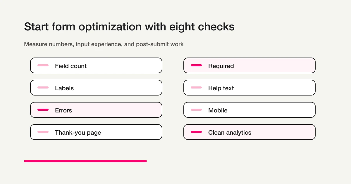
| Check | Question |
|---|---|
| Field count | Does the form feel heavy before input starts? |
| Required fields | Are mandatory fields truly necessary? |
| Labels | Can the user understand each field without guessing? |
| Help text | Does the form explain ambiguous decisions? |
| Error messages | Can the user recover without frustration? |
| Mobile input | Does the keyboard and control type match the expected answer? |
| Thank-you page | Does the visitor know what happens next? |
| Clean analytics | Are noisy submissions removed from performance analysis? |
Have someone who did not build the form submit it on a phone. A fresh tester will notice confusion faster.
The Thank-You Page and Auto-Reply Are Part of Conversion
Form optimization does not stop at the submit button.
After submission, the visitor needs reassurance.
A useful thank-you page includes:
| Element | Example |
|---|---|
| Confirmation | Your request has been received |
| Timing | We usually reply within two business days |
| Next step | Check your inbox for the confirmation email |
| Reminder | If you do not see it, check the spam folder |
| Useful link | Download, FAQ, booking change, related resource |
Auto-reply email reinforces the same message.
For a webinar, include date, time, join link, and reminders. For a booking request, include the requested times and what "confirmed" means. For a resource download, include the resource URL. The Form Auto-Reply Email Examples guide gives reusable structures by use case.
For confirmation-message examples, the difference between inline confirmation and a dedicated page, and tracking cautions, use the Form Thank You Page Guide.
Clean Analytics Matter: Do Not Count Noise as Conversion
Raw submissions are not always meaningful submissions.
A contact form may receive sales pitches. A lead form may receive duplicates. A team may create internal tests. A spam bot may submit junk.
If those rows are counted as conversions, the form looks healthier than it is.
Exclude or label:
| Submission type | Why it should not inflate conversion |
|---|---|
| Sales pitches | They are not real inquiries |
| Spam | They are noise, not demand |
| Internal tests | They verify the form, not the market |
| Duplicates | They may represent one person, not multiple opportunities |
| Obvious mistakes | They cannot be acted on |
FORMLOVA supports sales-pitch detection and response status workflows, which makes it easier to evaluate valid submissions separately from raw submission count. For more detail, see the Contact Form Spam Guide and the Contact Form Operations Guide.
This distinction matters for SEO and paid acquisition too: fewer clean submissions can be more valuable than more noisy ones.
Use-Case Optimization Examples
Different forms fail in different ways, so the best optimization target depends on the workflow.
| Form type | Most common friction | Better next step |
|---|---|---|
| Contact form | Too many B2B fields required by default | Keep email, category, message, and consent; make company and phone conditional or optional. See Contact Form Template. |
| Lead capture form | Qualification questions block a simple download | Use a lighter first form, then ask deeper sales questions after follow-up. See Lead Capture Form Guide. |
| Registration or event form | Users are unsure whether they are actually registered | Make the thank-you page and auto-reply explicit about time, place, reminder, cancellation, and next step. See Registration Form Guide and Event Registration Form Guide. |
| Booking form | Too little availability data creates scheduling loops | Ask for enough time preferences to reduce back-and-forth without turning the form into a full intake interview. See Reservation Form Guide. |
| Survey form | Too many open-ended questions reduce completion | Use structured questions for trends and a small number of open text fields for explanation. See Survey Form Guide. |
How FORMLOVA Helps the Optimization Cycle
FORMLOVA is designed for work after the form is published, which matters because optimization is a cycle: create, review, publish, watch submissions, remove noise, improve fields, and re-check valid conversion.
You can ask for changes in operational language:
Review this contact form and move fields that are not needed for first reply into optional.
Rewrite the error messages so each one explains the exact fix.
Add a clearer thank-you page and auto-reply with the next step and response time.
Show last month's contact form conversion rate excluding sales pitches and tests.
The broader Form Automation Guide explains how auto-replies, routing, exports, reminders, analytics, and MCP operations fit together.
Common Form Optimization Mistakes
The biggest mistakes are predictable: removing so much that the team cannot act, making useful-but-not-essential fields required, using placeholders as instructions, writing vague errors, testing only on desktop, ignoring the thank-you page, counting noisy submissions as conversions, and treating optimization as a one-time task.
The fix is also predictable: keep workflow-critical fields, move nice-to-have fields to optional, use visible labels and help text, write errors that explain the fix, test on mobile, confirm the next step after submission, and track valid submissions separately.
A form is often the final step in a visitor's goal. If the article, landing page, or comparison page helps the visitor decide, but the form creates hesitation, the experience is incomplete.
Form conversion optimization is where content, product UX, and operations meet.
FAQ
What is form conversion optimization?
It is the process of improving the path from visitor intent to successful submission and useful follow-up: fields, required settings, labels, validation, mobile input, thank-you pages, auto-replies, and clean analytics.
What should I optimize first?
Start with required fields. Keep only what is necessary for receiving, replying, routing, confirming, or acting on the submission.
How many fields should a form have?
There is no universal number. Ask whether each field is required now, optional now, or better asked later.
Should phone number be required?
Require phone number only for urgent contact, same-day booking changes, offline coordination, or high-intent consultation. For basic contact and resource downloads, make it optional.
How should form error messages be written?
Explain the exact fix. Instead of "invalid input," write messages such as "Include @ in the email address" or "Select a first preferred time." Do not rely only on a red border.
Can FORMLOVA support form conversion optimization?
Yes. FORMLOVA can help revise fields, required settings, thank-you pages, auto-replies, statuses, sales-pitch filtering, exports, and analytics after real submissions start arriving.
Disclosure and Verification
This guide is for teams improving contact forms, lead capture forms, registration forms, booking forms, and other operational forms. I work on FORMLOVA, so the workflow examples use FORMLOVA directly. I reviewed form design, accessibility, input assistance, and the post-search visitor experience on May 1, 2026. Treat this as product and form-design guidance, not legal advice for privacy, hiring, healthcare, finance, or regulated workflows.
Related Articles
- Form Creation Guide -- Choose Templates, Fields, and Workflows
- Form Thank You Page Guide -- Confirmation Messages, Next Steps, and Tracking
- Form Error Message Examples -- Validation Copy That Helps Users Finish
- MCP Form Service Guide -- From AI Creation to Form Operations
- FORMLOVA Form Automation Guide -- Auto-Replies, Routing, Sheets Sync, and MCP Operations
- Form Services Comparison Hub -- Pricing, Alternatives, and Operations